
Hello there! Welcome to the world of Pokemon… battle user-interfaces. Pokemon is a franchise spanning over 25 years, and in that time-span they’ve made hundreds of games over nine “generations”, with each one making notable improvements over the last. Or have they? Today I’m going to take a journey through each generation of Pokemon and analyze / rank their user-interfaces.
Fair warning, I’m not going to look at EVERYTHING. Video games have pages upon pages of screens with UI on them, and I’d be here an entire year if I looked at each and every one of them. So, I’m going to look through the franchise through the lens of a Pokemon battle. Even then, that’s a little much for me to look over. So, I’m going to be looking at two specific screens for each main-line Pokemon game: the main battle screen, and the move selection.
Let’s break that down a bit, shall we?
The Make-Up of a Pokemon Battle
So, how many games are we going to be looking at? What exactly is a Pokemon battle like? Am I alright? Well, I’ll be able to answer two of these.
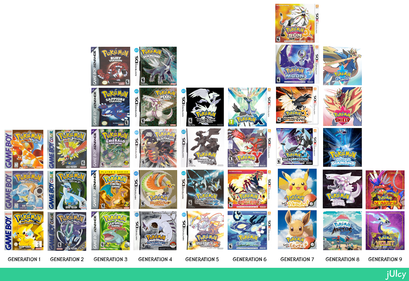
First up, the game line-up. Over each generation of Pokemon, there has been at minimum one game released. Including Generation IX, this comes out to thirty-seven games. Obviously, I’m not looking at EVERY one of them, as each release is split into two games for consumer purposes. This means I’ll actually be looking at roughly twenty games.
However, I don’t think it’d be very fair on you to make you read a seventy page essay on Pokemon battle analysis user-interfaces (UI), so I’ve decided to split this post up by either generation or console. This first post features Generations I & II, both of which appeared on a version of the Nintendo Gameboy.
Second, what exactly is a Pokemon battle? If you’re a Pokemon aficionado, feel free to skip past this little bit, but I’m going to be going over the specifics of the battle screen.
Let’s say you’re playing the game, and moving your player through some grass on screen. All of the sudden, an exclamation appears! You’ve encountered a wild Pokemon! The game screen dissolves, pulling up a new screen: the battle screen. While in this state, you can make one of four decisions. You can click the “Fight” button, which will take you to a new menu where you choose a move to attack. You can click the “Bag” or “Item” button, depending on the game, and go to a new menu where you can use an item. You can click the “Pokemon” button, which takes you to your team line-up where you can select another Pokemon to switch into the battle or inspect your team. Lastly, you can select the “Run” button, which lets you leave the battle if you are able.

Complicated when you put it into words, huh? And those are just the main menu buttons.
Main Menu UI Elements
There are a few other necessities that have existed since the second generation of Pokemon – little pieces of text and other indicators that give the player information about the current creature they have out fighting.
Side Note: I’m glossing over Generation I for now, but I’ll touch on it again when we get to the analysis portion. People who have played the games might know why.
Anyways, these pieces of information are absolutely imperative to the structure of the battle user-interface. They can be broken down into the following things:
Regarding your Pokemon: they have a 2D sprite (or 3D model in later generations), a name, level, and gender written out, a slider indicating their current health (as well as a numerical counter), and another slider indicating their current experience amount.
The enemy Pokemon has mostly the same UI aspects: a figure representing them, a name, level, and gender, and a slider representing their current health. Notably, there is no numerical counter for the enemy, which leads into battle strategy that is outside the scope of this post.
For both teams, there’s a small icon bar showcasing how many Pokemon remain for each team – this comes and goes depending on the generation, but I’d consider it essential information for the player to know.
Move Selection
There’s one last thing that’s considered essential for a Pokemon battle user-interface, and that’s the move layout. This part only pertains to the player, since we can’t see the opponents moves during the game.
After selecting the “Fight” button, your moves will appear. These moves will always have a Name, a Type, and the amount of “Energy” remaining for that move. Later games will expand on this by adding the effectivity of a move, but I’ll get into that once it becomes implemented in the games themselves. They’ll also play around with how this information is displayed, but in the beginning, these were all shown through simple text.

Prefacing the Inspection
Yowza, that’s a lot of set-up, isn’t it? Well, I ain’t done yet, so grab the popcorn and sit your tuchus back down.
There’s a few things I’m going to be looking out for when analyzing these screens. As well, I’m going to be ranking them depending on these aspects. These components I’m going to be looking out for are color palettes, font choice, general size of the UI, and juice.
Wait, juice? Yeah. It’s going to be a little “bonus” for games that include some special aspect that helped either move the series forward. There’s also going to be some negative juice (Sour? Rotten? You get the picture) for games that either did away with something important or just pissed me off for some reason or another.
Of course, these rankings are going to be entirely my opinion, so if you disagree with my claims then please let me know in the comments! I’m interested to know what other people think about these screens and whether or not I missed anything.
Generation I – A Strong Start
Pokemon Red & Blue released on the Gameboy between 1996-1998, depending on the region. The original Game Boy doesn’t exactly have the strongest processing power; I mean, it has exactly four colors available to it, already limiting the potential.
This game has the distinction of being the first Pokemon game, meaning it had a lot it needed to lay the groundwork for.
Let’s take a look at the main battle screen.

Quite straightforward, isn’t it? We’ve got those four colors being delegated mostly to the Pokemon sprites to help differentiate them, with one color being used for the health meter. There’s only one font, with it being bolded or made smaller for certain aspects. The general size of the UI is kind of large, and while I do enjoy large UI, this is a bit much. However, there isn’t much else to put on the screen at this point in the franchise, so I’ll give it a pass.
Real quick though, I need to talk about that weird white box on the bottom left side of the screen. This is pure decoration. In fact, the only reason it’s there is to hide the Pokemon’s lower part of their body so that the artists don’t have to draw any more of it. I’m bringing this up now because it’s going to come back in the “FIGHT” menu, which I have some… opinions… on.
Speaking of, let’s click on that “FIGHT” button!

Alright, I see where they’re going with this. Once again, very straightforward. Something I don’t appreciate in the first two generations of Pokemon games is how the move information covers your own Pokemon. They’ll fix this by the third generation, but there’s kind of just a waste of space happening on the bottom right and left corners.
You might be thinking, “well, maybe the move names cover up that space?” Nope. There’s a character limit of twelve; this leaves a wee bit of space on the right-hand side. Nevertheless, this still leaves a gaping hole on the left side of the screen.
In these early generations, the games were opening menu boxes on top of the menu boxes already there, so that empty space is the weird extra menu bit from the main battle screen that I mentioned before. Now, it’s not only decoration, but it’s also wasting space that could’ve been used to display other information.
So, overall, this is a strong start to a multi-decade spanning franchise, but now I’m ready to move on to Generation II… wait. No I’m not.
There’s a little yellow rat who wants a bit of your attention.
SCORE: ★★★★☆☆☆☆☆☆
VERDICT: A good start, but nothing special.
Not Quite out of Generation I
In 1998, capitalizing on the success of the anime, Game Freak (the company behind the games) released Pokemon Yellow, a repackaged version of Red & Blue that has some key differences.
However, much like what we’ll see when we hit Generation II, these differences don’t really affect the battle UI all too much.


The only differences here are the colors, and those are due to these being played on a Gameboy Color as opposed to its native Gameboy. Everything else is exactly the same, so my opinions are exactly the same too.
SCORE: ★★★★☆☆☆☆☆☆
VERDICT: Exactly the same as Red & Blue, ignoring the color differences.
Generation II – Technically an Improvement
Released in 2000, Pokemon Gold & Silver make MANY improvements to the formula established in the previous generation. As I mentioned in the last section however, these improvements are mostly on the technical side of things and don’t impact the battle UI all too much.
Unlike Pokemon Yellow though, there are actually a few differences. Let’s take a look!


Of course, the main key difference is the color palette. We now have access to more colors, but still not a large array of them. These colors are dedicated to bringing our Pokemon to life, instead of helping differentiate the UI more and that’s fine by me.
There’s actually a few other differences, one of which I glossed over earlier. The first major difference is the addition of a gender marker by the Pokemon’s level. See, prior to Generation II, all Pokemon were Non-Binary, so there was no reason to have a marker indicating which gender they had. Now, there’s mechanics revolving around a Pokemon’s gender, meaning it’s important that this be viewable in the main battle menu screen.
The second difference, which is more minor, is that the “HP” text has been given a fresh coat of paint and has been combined into the UI box itself, helping give it more of a grounded location as opposed to just floating in the air.
Another minor difference is they changed the “ITEM” button to “PACK”. I honestly have no clue why they did this, but they’ll continue to mess around with the order and naming of this menu.
The last difference, which can’t be seen in this screen (apologies), is now that the bar at the bottom under the Pokemon’s health actually has a purpose – it keeps track of experience.
In Generation I, that bar was purely decorative. Now, when a Pokemon defeats an opponent and gains experience, that bar will start to fill up, much like how the HP bar will empty out. This is an important change, because managing how much experience your own Pokemon has and being able to tell when they’re going to level up is crucial to gameplay.
Nothing has changed regarding the “FIGHT” menu. This is really disappointing to me, because I was hoping they would fix that by this point. Oh well.
SCORE: ★★★★★☆☆☆☆☆
VERDICT: Much of the same, but it is TECHNICALLY an improvement.
One Last Disappointment
Of course, we’re not done with Generation 2 quite yet. We’ve still got to check out Pokemon Crystal, released in 2001 for the Gameboy Color.
As with Pokemon Yellow, there’s pretty much nothing when it comes to battle UI differences. Take a gander.
Yeah that’s… that’s the same thing. All the improvements and differences are elsewhere in this game. So, it’s going to get the same grade as its predecessor.
SCORE: ★★★★★☆☆☆☆☆
VERDICT: Literally nothing is different. It’s just Gold & Silver replicated.
Wrap-Up
We’d be here forever if I talked about every single game in one post (and believe me, I tried) so we’re going to stop here for now. If you’re interested in seeing how the rest of the franchise scores, make sure to subscribe and keep a look out for future posts. Stay fresh, friends!

This was like a trip down memory lane mixed with very interesting critique and discussion, it was a great read! I love the little Pokemon battle you drew before getting into the UI, I honestly thought it was part of the game in some way because it was so spot on.
LikeLiked by 1 person